Doing it with (user) style
I’ve long since been fascinated with changing the style of a site to fit with my needs. Early experimentation with the Web Developer Toolbar lead to me writing Print it your way for A List Apart back in May of 2004.
The capacity to restyle and customize sites to match our personal use is a fundamental part of what we do on the web. My friend and colleague John Allsopp wrote about it back in April of 2000 when he wrote the visionary A Dao of Web Design, also on A List Apart. We have the ability to adapt pages and restyle all or parts of them for our own use, beyond what the author may have intended. This is the web.
WCAG 1.0 Resources
I need the WCAG checklist and guidelines as a reference when I’m testing or writing a report. When pointing out areas of concern to a client, I generally reference the specific checkpoints in question so that their developers and designers can go back to the guidelines to see what needs attention. My work isn’t driven by the checklist, but the checklist is definitely a tool that I still use.
The problem? The way the guidelines and checkpoints are laid out, doesn’t really match the way that I work. I need a quick reference – mostly because I don’t have the exact numbers of all the checkpoints memorized.
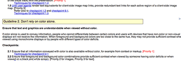
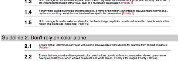
With that in mind, I created some user styles for both the WCAG Guidelines and the WCAG Checklist to make them easier to read at-a-glance, I made the numbers for the checkpoints bigger, added in some line-height and removed anything else I thought got “in the way” of me being able to reference them quickly and efficiently.
Screenshots:


I’ve posted them at userstyles.org which makes use of the Stylish extenstion for FireFox—allowing you to manage your user styles on a per site basis.
It would be silly to suggest that these will meet your precise needs, but adding these styles certainly made the checkpoints and guidelines easier for me to read and use.
Feel free to give them a try and let me know how they work out for you. I’m also interested in knowing how other people use the guidelines and checklists. Are there other styles that would be useful for other use case scenarios for the guidelines and checklists?
Update
Just to be clear – once you install the user styles, you need to go to the web pages in question to see them in action. Namely the WCAG Guidelines and the WCAG Checklist. If you don’t go to those sites, you won’t see any effect at all.
4 Responses
Comment by feather — Oct 22 2007 @ 9:25 am
Ben – sure, that works too :)
Sadly, Opera hasn’t worked on my MacBookPro in ages. Every time I try to start it up, it hangs the machine. I actually took the Opera challenge a while ago and made it my default browser and I quite liked it. Then one day, poof! It wouldn’t start and I haven’t been back since. Which is too bad, because—as you know—I’m a huge fan of Opera because they get so many things right when it comes to accessibility.
Comment by Mike Cherim — Oct 23 2007 @ 8:13 am
Your modification of the WCAG styling is excellent Derek. Much clearer.
Comment by Richard Morton — Oct 31 2007 @ 2:31 pm
Looks good, I haven’t experimented with this sort of thing yet, but I can see it being very useful for those sites that I regularly visit and think, if only the colours were different or that text was in a better font.
It could start a craze along the lines of the Zen Garden but producing different styles for existing sites (just don’t tell the marketing teams at those big brands though)

Comment by Ben Buchanan — Oct 22 2007 @ 9:17 am
You can also apply user stylesheets per site using Opera. Just save the CSS file somewhere appropriate; then go to the site in question, right-click and select “edit site preferences”, go to the “display” tab and choose the CSS file in “my stylesheet”. Done!
No extensions required :)