You are reading an archived post from the first version of my blog. I've started fresh, and the new design and content is now at boxofchocolates.ca

5 Lessons in Blog Advertising

June 18, 2008

Ah, to advertise or not advertise, that is the question.

Snook posted about his “SideBar Ads” from the gang at SideBar Creative the other day, and it reminded me of the different things I tried here on my blog. Over time I’ve had two different iterations of ad support:

  1. simply running Google Ads; it worked reasonably well
  2. text links; ultimately I removed them and got out of the text link game.

I may or may not go back to it, but I thought I’d put a few ideas out there as to why I got out.

Lack of Automation

Lesson learned: ensure that all payments to you are done through some type of automation — even a simple recurring PayPal payment would sort this out.

The problem I had with automation was very simple: the group that had placed text link ads on this site wasn’t fully automated. While their side of things was in terms of placing the ads on the site, they weren’t automated in terms of payment. For a stretch, I went 6 months without receiving a payment.

At that point, I had to simply ask “what’s the point?”

Ease of Integration

Lesson learned: just like any project, get the requirements from the client first, have them look at a prototype to see if it meets their needs and revise your ad integration code.

Placing the code on the site was easy as pie.

The first time.

After that, there were several emails where requirements seemed to change: “Can you please add this bit of code here?” or “We need you to add an image before your code and it has to be something like this.”

Yes, I’m being kind of vague, but my impression of what happened is that they put something out there and then were responding to requests from their advertising clients in order to make them happy. And by doing so, they were actually making me unhappy.

Organization

Lesson learned: do everything you can to provide just one point of contact for site owners so that we are not left wondering who to contact.

Over the course of running the text ads, I had contact with at least four different people and it was very unclear to me which person I should be contacting at any given time.

Account manager? I honestly can’t tell you. Should I contact their tech person or someone else if I have integration problems? What about payment issues? account manager or the accountant?

It was completely unclear to me and it contributed to my overall dissatisfaction with the entire experiment.

Value

Lesson learned: If the ads aren’t of value or relevance to your audience, there isn’t much point.

Ultimately there was no value in it for me as I wasn’t getting paid. That aside, what really concerned me was that there was zero value in it for the readers of this site. Zero.

I like what Snook and others have done – the ads that they run are relevant to the industry, not simply text ads that appear to be there for page rank purposes.

If you can provide relevance, then you can provide a good reason for the ads to be there. If you can’t, in my opinion, it isn’t worth it. Even simple Google ads are great at attempting to deliver on the promise of relevance.

Spamalicious

Lesson learned: if it looks like spam (even if it isn’t) it is still spam in the eyes of readers. If you’re going with Text Link ads, make sure it doesn’t look like your site has been hacked — you need to integrate it into the site so that it looks and smells like and ad. It needs to be obvious!

James Craig said to me “Dude, your site has been hacked – there are all kinds of spam links in the footer.”

That sealed the deal for me. I needed to get out of this advertising gig for now.

My page rank had dropped quite a bit, though I can’t say for certain it was because of the text link ads, I wasn’t getting paid due to the lack of automation, and ultimately I questioned the value of the ads for anyone reading the blog.

Interestingly, I received an email from the text link company saying they could help me get my page rank back. Their solution? Send a message off to Google explaining things and resubmit the site using Google’s Webmaster Tools. In their “instructions” on how to go about doing this, they mentioned that several of the sites that they had in their ad network had similar Page Rank problems! Here’s another excerpt that made me cringe:

Please note that this form is usually used for webmasters that may have been involved in “black hat” SEO techniques and have “spammed” the engines to some degree and been blacklisted. Although that is not the case with your site, you still use this form to resubmit your site to get your page rank back.

Ah, right.

Refresh Ottawa Kickoff

January 5, 2008
Refresh Ottawa

Last year, just before SXSW, Jonathan Snook and I announced the formation of Refresh Ottawa. We (read: Jonathan) knocked out a quick site: Refresh Ottawa. We collected email addresses from interested parties.

And now, some 10 months later, we are holding our first get-together. A great way to start the New Year—we’ll be kicking off with a free event downstairs at the Clock Tower on Bank next Thursday, January 10th, 2008 from 7-9pm.

At each Refresh Ottawa event, we’ll have one or two presentations followed by networking/social time. On Thursday we’ll have Derek Featherstone (me) present “Accessible mapping with Google Maps” and Jonathan Snook will present on JavaScript Frameworks. Each session will be about a half hour leaving plenty of time to chat and get to know each other.

The social hour will be sponsored by Web Directions North, one of the world’s top conferences for web geeks. (Full disclosure: I am part of the organizing team for Web Directions North and both Jonathan Snook and I will be speaking at WDN in Vancouver later this month)

We’ve added the event to upcoming: Inaugural Refresh Ottawa event. Please RSVP there if you’re attending so we can plan for numbers – we need to let the Clock Tower know how many people to expect.

Refresh Ottawa is a community of designers and developers working to refresh the creative, technical, and professional culture of New Media endeavors in the Ottawa region. Promoting design, technology, usability, and standards, Refresh Ottawa is a part of Refresh and the associated Refreshing Cities.

Web Standards Job in Ottawa

October 31, 2007

This may seem a little odd, but within the last 15 minutes, we’ve seen search hits (thanks to Shaun Inman’s mint) both here on the blog and on the company site for someone looking for a web standards job in Ottawa.

This is a good thing, and this post might be too late. Then again, maybe it won’t… Sooooo:

If you are looking for a web standards based job in Ottawa, please go over to the company site and contact us today with your resume, salary expectations, and a portfolio. You may be just what we’re looking for, and we might be a perfect match for you.

What are you waiting for?

Filed under:

Doing it with (user) style

October 21, 2007

I’ve long since been fascinated with changing the style of a site to fit with my needs. Early experimentation with the Web Developer Toolbar lead to me writing Print it your way for A List Apart back in May of 2004.

The capacity to restyle and customize sites to match our personal use is a fundamental part of what we do on the web. My friend and colleague John Allsopp wrote about it back in April of 2000 when he wrote the visionary A Dao of Web Design, also on A List Apart. We have the ability to adapt pages and restyle all or parts of them for our own use, beyond what the author may have intended. This is the web.

WCAG 1.0 Resources

I need the WCAG checklist and guidelines as a reference when I’m testing or writing a report. When pointing out areas of concern to a client, I generally reference the specific checkpoints in question so that their developers and designers can go back to the guidelines to see what needs attention. My work isn’t driven by the checklist, but the checklist is definitely a tool that I still use.

The problem? The way the guidelines and checkpoints are laid out, doesn’t really match the way that I work. I need a quick reference – mostly because I don’t have the exact numbers of all the checkpoints memorized.

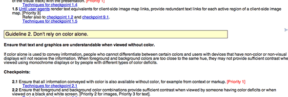
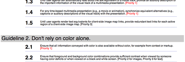
With that in mind, I created some user styles for both the WCAG Guidelines and the WCAG Checklist to make them easier to read at-a-glance, I made the numbers for the checkpoints bigger, added in some line-height and removed anything else I thought got “in the way” of me being able to reference them quickly and efficiently.

Screenshots:

WCAG 1.0 Guidelines: Before with default styling

WCAG 1.0 Guidelines: After with user styles

I’ve posted them at userstyles.org which makes use of the Stylish extenstion for FireFox—allowing you to manage your user styles on a per site basis.

It would be silly to suggest that these will meet your precise needs, but adding these styles certainly made the checkpoints and guidelines easier for me to read and use.

Feel free to give them a try and let me know how they work out for you. I’m also interested in knowing how other people use the guidelines and checklists. Are there other styles that would be useful for other use case scenarios for the guidelines and checklists?

Update

Just to be clear – once you install the user styles, you need to go to the web pages in question to see them in action. Namely the WCAG Guidelines and the WCAG Checklist. If you don’t go to those sites, you won’t see any effect at all.

Web Directions North, 2nd edition

October 16, 2007

One evening in 2006 during a group iChat, Dave Shea, Maxine Sherrin, John Allsopp and I threw caution to the wind and decided that we were all on board. We were going to bring the stand-out web conference from Australia—Web Directions—across the Pacific Ocean to Vancouver.

Here we are close to a year and a half later, and we’re excited to announce that we’re doing it again. Following on the success of Web Directions North from February 2007, we’ve just launched:

web directions north: Vancouver, BC, Canada; Jan 28 - Feb 2, 2008

We’re really happy with the line up of speakers and the entire week’s schedule – it is going to be an amazing conference and we hope you’re as excited as we are.

What are you waiting for? Go ahead over to the site, check out the WDN 08 schedule overview and the stellar lineup of speakers. We’d love to see you there!

An Event Apart, Deep Dish Edition

September 12, 2007

It is hard to believe that it has already been a week two weeks since An Event Apart in Chicago. I had never been to Chicago prior to AEA (assuming you don’t count layovers in O’Hare as actually being in Chicago), so I have to admit I was incredibly excited to be on my first trip to the mid-west. I have but two regrets:

  • not having enough time to explore the city a bit more, and
  • not being able to eat more than one and a half slices of the Giordano’s deep-dish pizza we ordered on closing night

I gave a new talk: Accessibility: Lost in Translation that combined some new material with some of my favourite old classics. The premise is this: as developers, we tend to see a mockup, a polished design or a wireframe and then translate that into code. And—if we’re not careful—during that translation process, we lose some of the nuances and detail that actually make the interface meaningful, effective and pleasant to use. What that in mind, we examined a number of common design “patterns” and scenarios to learn what we can do to provide a better user experience for people with disabilities. After all, accessibility is part of user experience, and much more than just ticking off checkboxes to be accessible, right?

It was an absolute honour to be part of the speaking line up, and I’m thankful that it was a single-track conference so that I wasn’t speaking at the same time as one of the others! It also meant that I was able to see a lot of the other presentations and do a bit of learning myself. I love it when that happens! Thanks to Jeffrey and Eric for inviting me to speak—it truly was a pleasure.

A hearty thanks to the audience. It was extraordinary to chat with so many of you after my presentation, during lunches and breaks. One of the things I savour about speaking at conferences is the chance to talk to people about the kinds of problems they are trying to solve in their everyday work. It is reality, and that’s something from which we all benefit.

IronFeathers

August 14, 2007

It has been quite some time since my last post (Swimming, Biking and Running Scared), but thought it appropriate to give a quick update on how the IronMan went.

The bottom line? We did it! We even created an entire site dedicated to the trek: ironfeathers: swim. bike. run., the new home for all of our thoughts about IronMan, triathlons, training etc. Hope to see you over there!

Swimming, Biking and Running Scared

May 6, 2007
Me, signing up for IronMan 2007

I’m scared.

If you know me, then you probably know that I signed up for IronMan 2007, Lake Placid, NY to take place July 22. If you don’t know me, or didn’t know that, now you do.

IronMan triathlons are endurance events that require every athlete to challenge themselves to complete the following:

  1. Swim 3.8km (2.6 miles)
  2. Cycle 180km (112 miles)
  3. Run 42.2km (26.2 miles)

Continue reading Swimming, Biking and Running Scared

SXSW: The impact of music

April 1, 2007
The Mother Truckers Logo: The long-horn salute with a cowboy hat perched on the index finger

Two of my favourite moments of SXSW this year both involved music.

The first was a night that started out and ended fairly innocently, but involved a great non-6th Street event. I was very excited to see some of my Australian friends again (Lachlan, Lisa, Lisa, Cam, and Anson—who would later be mistaken for James Craig—and his girlfriend Irena), and somehow they convinced me that we should go see The Mother Truckers at The Continental Club. Sure, some alt.country whatever band. Yeah, yeah. Just go hang out with my friends really.
Continue reading SXSW: The impact of music

WCAG 2: A Done Deal

April 1, 2007

At last. I was beginning to wonder if we’d ever see an end to this, but it looks like WCAG 2.0 has finally been sorted out.

This is a great move forward for web accessibility—for the web as a whole—one which will leave a permanent mark. Finally getting WCAG 2.0 sorted out was my goal when I joined the W3C, and now that it has been accomplished, I’m happy to say to all those out there that thought it couldn’t be done: We did it!.

Olivier (Oli) Farlop